Font Keyboard: Text Fonts+
- 3.8
- Rating
- 10.00M
- Installs
- Free
- Price
 Analysis by App-foxy
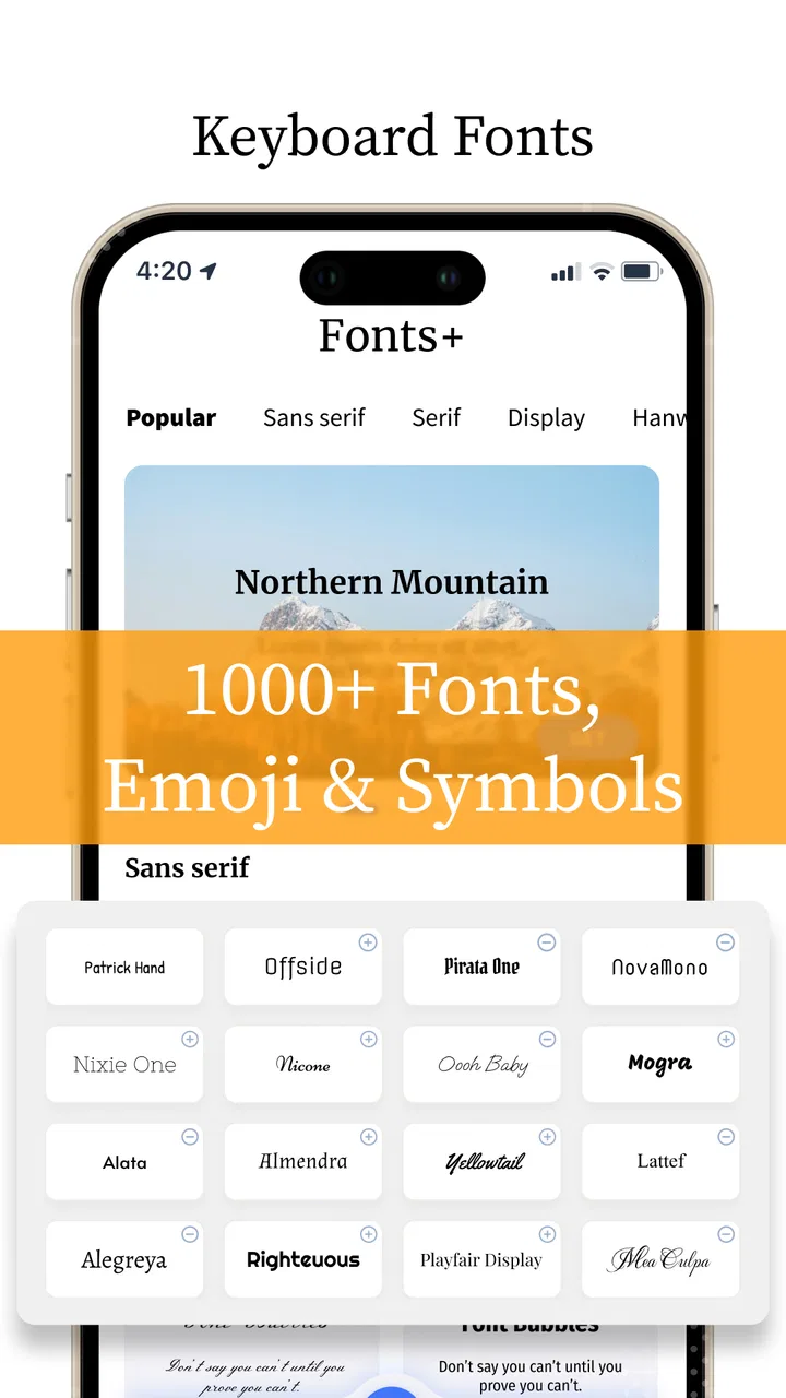
Changing the way a message looks usually takes more effort than it should. Most phones offer a few basic keyboard themes, while social apps often limit how much personality you can add to text. Font Keyboard: Text Fonts+ takes a more direct approach: it puts decorative text styles, emojis, stickers, GIFs, and keyboard themes in one personalization app. After spending time with it, I found its most useful capability is not simply “having many fonts,” but letting me switch from ordinary typing to attention-grabbing text without leaving the conversation.
That difference matters in everyday use. I can write a normal sentence, change its appearance before sending, add a symbol or sticker, and return to regular typing when the message is finished. It feels more practical than opening a separate font website, copying text, and moving back to the app where I started. The result is still a keyboard rather than a full design editor, so it works best for quick expression, not carefully produced graphics.
Why the font keyboard is the app’s main strength
The central idea is simple: the keyboard becomes a personalization layer. Instead of treating fonts as something you apply only in a finished image, the app makes them available while writing captions, comments, messages, profile text, and short posts. That makes the feature especially appealing when I want a sentence to look different immediately, without interrupting my train of thought.
You May Also Like

 Blood Strike: 2.5 Anniversary
Blood Strike’s Loadouts Turn Every Drop Into a Tactical Gamble
A close look at Blood Strike’s custom loadouts: how fast access to signature weapons reshapes its battle royale rhythm, rewards preparation, and narrows the gap between fights.

 Pandora - Music & Podcasts
Pandora’s Music Is Easy to Start, but Harder to Recover
Pandora’s strength is its low-effort path from a seed to a station. Its weak spot is how much confidence it asks you to place in connection, setup, and quiet recovery.

 8 Ball Pool
 Is Built on Rivalries, Rematches, and Routine
A close look at the rivalries, rematches, shared routines, and unanswered safety questions that turn a quick pool match into a persistent mobile community.

 Samsung Music
’s Quiet Strength Is Playing What You Already Own
Its reach comes less from spectacle than from dependable access to a personal library. That simplicity is both the app’s strongest retention engine and its ceiling.

 AccuWeather: Weather Radar
AccuWeather Review: A Quick, Clear Forecast for Everyday Decisions
For everyday plans, the best forecast is the one you can understand quickly. AccuWeather makes rain timing, radar, and local conditions easy to act on, with a few trade-offs.

 Hill Climb Racing
Why Hill Climb Racing Still Turns Crashes Into One More Run
A tiny car, a bumpy hill and one more upgrade: Hill Climb Racing keeps resurfacing because its simple chaos makes every near-miss feel personal.
More From Our News Desk



The available styles are most useful when they serve a purpose. A decorative typeface can make a short greeting feel playful, while a bold-looking style can help a heading stand out in a caption. Symbols and emojis can add emphasis without requiring a long explanation. I would not use an ornate style for every message, but that is not really the point. The value comes from having a quick choice when ordinary text feels too plain.
The app is developed by Fonts, Emojis & Symbols Studio and belongs to the personalization category. It is free to start, carries an Everyone age rating, and has reached more than ten million installs. Those details fit the product well: this is a casual customization tool aimed at broad use rather than a specialist writing application.
Its store summary mentions fonts, emojis, stickers, GIFs, and themes, but the font keyboard is what gives the package its identity. Themes change the surrounding appearance of the keyboard, while font styles change what I actually send. I see the themes as a nice comfort feature; the text transformation is the reason I would keep the app installed.
What changes when text is styled before sending
Styled text changes the visual rhythm of a message. A short phrase can look like a title, a playful aside, or a status update instead of another block of standard characters. That can be useful in group chats where a quick visual distinction helps people notice an announcement, or in social captions where the first line needs to catch the eye.
There is also a practical trade-off: decorative characters are not always interpreted identically across every service or device. Even when a message appears attractive in the composer, the recipient’s app may display some symbols differently. I therefore prefer styles that remain readable and use the more elaborate options sparingly. A font that looks impressive but slows down reading is a poor choice for anything important.
This is one reason I would not describe the app as a replacement for a professional design tool. It gives typed content a new surface treatment, but it does not turn a message into a poster. Its strength is speed and convenience, not precise control over layout, spacing, or brand typography.
How the experience works in practice
Once the keyboard is available, the workflow is built around choosing a style while typing. I can begin with a normal sentence, select a different font treatment, and continue writing in the new appearance. The change feels most natural when I decide on the style before composing a longer caption, although switching halfway through can be useful for separating a heading from the body.
I found a small but important habit makes the experience better: write the message first, then experiment with the style. If I browse options while trying to think of what to say, the novelty gets in the way. For a short phrase, choosing first is fine. For anything longer, composing normally and styling afterward reduces mistakes and keeps the message readable.
The keyboard format also makes the app more convenient than a copy-and-paste font generator. A separate website adds extra steps, may interrupt the app I am using, and makes it harder to try several versions quickly. Here, the customization is positioned where typing already happens. That is the real time-saving advantage, even more than the number of visual choices.
Emojis, stickers, and GIFs broaden the workflow beyond letter styles. I can treat a message as a small combination of text and visual reactions rather than switching among several tools. In a casual conversation, that feels smoother than searching for a sticker in one place, copying decorative text from another, and returning to the chat repeatedly.
The themes serve a different purpose. They do not necessarily improve the content of a message, but they can make the keyboard feel more personal during repeated use. Someone who types frequently may appreciate a look that feels less generic. Someone who only wants unusual text may find the theme choices less important and spend most of the time in the font controls instead.
A realistic daily example
Imagine I am preparing a social post for a weekend event. I write the main caption in ordinary text so the wording stays clear, then use a stronger decorative style for the short opening line. I add an emoji to signal the mood and perhaps a GIF in the related conversation when sharing the post with friends. The entire process happens from the typing area instead of moving between a browser, a text converter, and the social app.
That workflow is where the app earns its place. The font is not being used as decoration for its own sake; it separates the hook from the explanation. I would keep the details in a readable style because people scan captions quickly. The app gives me a visual accent, but my judgment decides where that accent helps rather than distracts.
For a birthday message, the balance changes. A playful font and sticker may suit a short greeting, while a longer personal note is better in standard text with a few emojis. The keyboard makes both approaches available, but it does not tell me which one is appropriate. That flexibility is useful, although first-time users may need a little experimentation before they develop a sense of restraint.
Small workflow tips that make it more useful
First, I recommend keeping decorative styles for short sections. A whole paragraph in an elaborate character set can become tiring to read and may look less polished than a simple heading. Using one style for the opening phrase and regular typing for the rest creates contrast without turning the message into visual noise.
Second, I would test a chosen style in the exact app where it will be sent. Text that looks balanced in one composer may feel crowded in another. This is especially important for profile descriptions, usernames, or captions where line breaks and character handling can affect the result. The keyboard makes creation quick, but checking the final appearance remains part of the job.
Third, I find it helpful to separate keyboard appearance from message appearance. A colorful theme can be enjoyable for daily typing, while a restrained font may be better for a professional group chat. Choosing a theme for comfort does not mean every message needs a matching decorative font.
Finally, I would avoid relying on styled characters for information that must be read perfectly, such as directions, work instructions, or an urgent announcement. Standard text is clearer and more dependable in those situations. The app is strongest when expression matters more than formal clarity.
Where the trade-offs become noticeable
The biggest limitation is that personalization can easily become clutter. More choices do not automatically produce better messages. If I keep switching styles, adding stickers, and inserting GIFs, the original point of the conversation can disappear. The app encourages experimentation, so users need to supply their own filter.
There is also a learning curve caused by having several kinds of customization in one place. Fonts, symbols, emojis, stickers, GIFs, and themes do different jobs, and the interface can feel busier than a standard keyboard. I appreciate the variety when I have a specific idea, but I would not recommend it to someone who wants the simplest possible typing experience.
Another consideration is compatibility. Decorative text is not the same as a conventional font file applied inside every application. It generally relies on special characters or styled output, so the final result depends on how the receiving service handles those characters. For casual posts this is usually an acceptable compromise, but it is a reason to keep a plain-text version of anything important.
The free entry point is helpful for trying the experience, but optional purchases are part of the model, ranging from under a dollar to around forty-one dollars per item. I would approach those choices carefully. The app is easy to enjoy without immediately paying, yet the value of additional customization depends entirely on how often I actually use the keyboard. A person who styles one message a month should think twice before buying extras.
Performance expectations should also be realistic. A keyboard with visual features and media-oriented tools may feel more involved than the basic keyboard already included with a phone. If speed, minimalism, and predictable behavior are the only priorities, the default keyboard is likely the better fit. Font Keyboard: Text Fonts+ earns its space by adding expression, not by making ordinary typing fundamentally better.
Privacy and comfort considerations in everyday use
Any time I install an alternative keyboard, I treat the decision more seriously than installing a simple wallpaper app. A keyboard sits close to everything I type, so I would review the system prompts and settings carefully before making it my daily option. That is not a criticism unique to this app; it is the normal responsibility that comes with using any third-party keyboard.
I would also decide whether I want it active all the time or only when I am creating decorative content. Keeping the regular keyboard as my default can reduce friction for banking, work, or sensitive conversations, while switching to this one for captions and casual chats preserves the app’s main benefit. That selective approach is a sensible compromise for cautious users.
The current version is 6.6.37 and it supports devices running Android 6.0 or later. For people using an older phone that meets that requirement, the compatibility range is useful. Still, the quality of the experience depends on more than the operating system: screen size, typing habits, and tolerance for a busier keyboard will affect whether it feels comfortable.
Who gets the most from it
I think the best audience is people who regularly post on social platforms, enjoy customizing messages, or want a quicker way to make short text visually distinctive. It is also a good match for users who like combining several expressive elements in one workflow instead of maintaining separate font, sticker, and GIF tools.
It can be particularly helpful for small personal projects. Someone running a casual community page might use a consistent visual style for short announcements. A student could make a heading stand out in a group conversation. A creative user might test several caption treatments before choosing the one that fits a photo. None of these tasks requires professional typography, but each benefits from instant experimentation.
People who should skip it are those who dislike third-party keyboards, rarely use decorative text, or need a clean, distraction-free typing surface. If I mostly write emails, work notes, and long documents, the standard keyboard or a dedicated writing tool is more appropriate. This app is not designed to improve grammar, organize ideas, or replace a full editor.
Compared with a font-converter website, the keyboard wins on convenience because it keeps the process close to the conversation. Compared with a standard keyboard, it wins on expression but loses some simplicity. Compared with a design app, it is faster for text but offers much less control over composition. Those comparisons make its position clear: it is a middle option for quick, social personalization.
The rating sits at a 4.0 average from around seventy thousand ratings, with roughly nine hundred fifty written reviews. I read that as a sign of broad appeal with room for individual preferences to matter. A keyboard can feel excellent to someone who loves visual customization and unnecessary to someone who values speed above all else. The app’s usefulness is therefore strongly tied to how often its central capability fits your conversations.
My final view after using the customization workflow
Font Keyboard: Text Fonts+ succeeds because it puts decorative writing where the decision happens: inside the keyboard. I do not need to plan a graphic or visit a separate converter just to give a short message a different mood. The combination of fonts, symbols, emojis, stickers, GIFs, and themes makes casual communication more flexible, while the free starting point makes it easy to judge the experience personally.
My recommendation comes with one condition: use it as an accent tool, not as a replacement for clear writing. The best results come from styling a heading, greeting, or short phrase and leaving essential information readable. Testing the result in the destination app and keeping the regular keyboard available are two simple habits that avoid most frustration.
For me, the app is worth trying if personalization is part of how I communicate. It gives social messages more character with very little switching between apps, and its keyboard-based approach is more practical than a separate copy-and-paste routine. If I wanted the fastest, quietest, most conventional typing experience, I would stay with the default option. But for captions, greetings, and expressive chats, Font Keyboard: Text Fonts+ offers a useful shortcut: it turns ordinary typing into a small creative choice without demanding a full design workflow.
FAQs for Font Keyboard: Text Fonts+
01What is Font Keyboard: Text Fonts+ and what does it offer?
Font Keyboard: Text Fonts+ is a versatile app designed to enhance your typing experience by offering a wide variety of unique and stylish fonts. Whether you're sending a text, posting on social media, or creating notes, this app allows you to customize your text appearance, offering an aesthetic upgrade to standard fonts.
02Is Font Keyboard: Text Fonts+ compatible with all devices?
Font Keyboard: Text Fonts+ is compatible with both Android and iOS devices. However, it is essential to ensure your device is running on a supported operating system version to guarantee optimal performance and access to all features. Check the app's requirements on the download page before installing.
03How user-friendly is Font Keyboard: Text Fonts+ for beginners?
Font Keyboard: Text Fonts+ is designed with user-friendliness in mind, featuring an intuitive interface that makes it easy for users of all experience levels to navigate. The app provides a straightforward setup process and in-app guidance to help beginners get started with customizing their fonts effortlessly.
04Are there any additional costs associated with Font Keyboard: Text Fonts+?
While Font Keyboard: Text Fonts+ offers a range of free fonts, it also includes premium options that require in-app purchases. Users have the choice to upgrade for access to exclusive fonts and features. It's advisable to review the pricing details within the app to understand any potential costs.
05Does Font Keyboard: Text Fonts+ affect device performance or battery life?
Font Keyboard: Text Fonts+ is designed to operate efficiently without significantly impacting your device's performance or battery life. However, as with any app, extensive use may lead to minor battery consumption. Regular updates by developers aim to optimize performance and address any potential issues.
Pros
- Wide variety of stylish fonts available.
- Easy integration with multiple apps.
- User-friendly interface.
- Customization options for fonts and colors.
- Lightweight and doesn't slow down device.
Cons
- Contains ads that can be intrusive.
- Limited free font options.
- Requires internet for some features.
- Occasional glitches in font application.
- Subscription needed for premium fonts.

Font Keyboard: Text Fonts+
Gallery